Eating problems for breakfast
Duke Electric
Hamilton, ON
As far as electrical equipment is concerned - from reverse engineering a motor to replacing a legacy product that's no longer available - Duke Electric has done it. With over 80 years in the business and well into three centuries of collective experience, Duke is proud to "service the hell out" of it's customers. However, times in the online marketing game were quickly changing. Not satisfied with resting on their laurels, the owners at Duke realized they needed to rebrand themselves and communicate their brand, services and products in a more modern way.
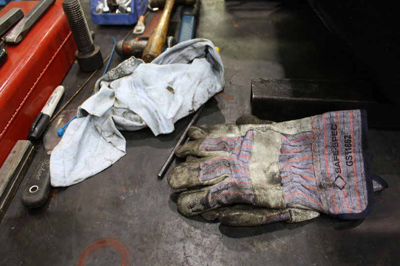
There's dirt under our fingernails, but we still consider it art.
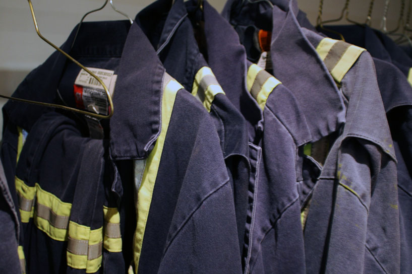
The logo design was a nostalgic nod to the past but modern enough to translate well online, uniforms, trucks and signage. Although a script font, the retro styling is reminiscent of motorcycles and ink shops - masculine enough to represent the craftsmen at Duke who love to get dirt under their fingernails.
They called him "the Duke."
"The Duke" Raab (who got his nickname from his signature bow tie) who started Duke Electric in 1933. Although the company may have been founded on blood - it's in the hands of the third generation now - it was time to think about building on this rich heritage instead of relying on it.
Keeping things colourful.
Let's just say that the boys at Duke have a very expressive and quite colourful vocabulary. But that's what makes them unique, funny and very authentic. It's also very in tune with the customers they work with. So why not keep things casual and relatable? The copy writing provided by Jen Dawson, gives a true voice to the Duke brand while still keeping things professional, informational and frickin' awesome!
They play AC/DC while fixing AC/DCs
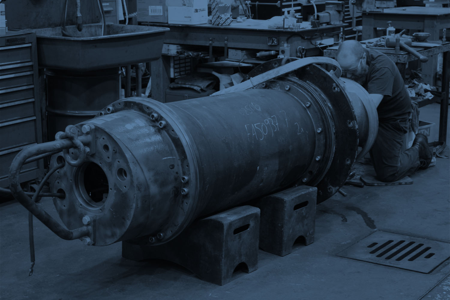
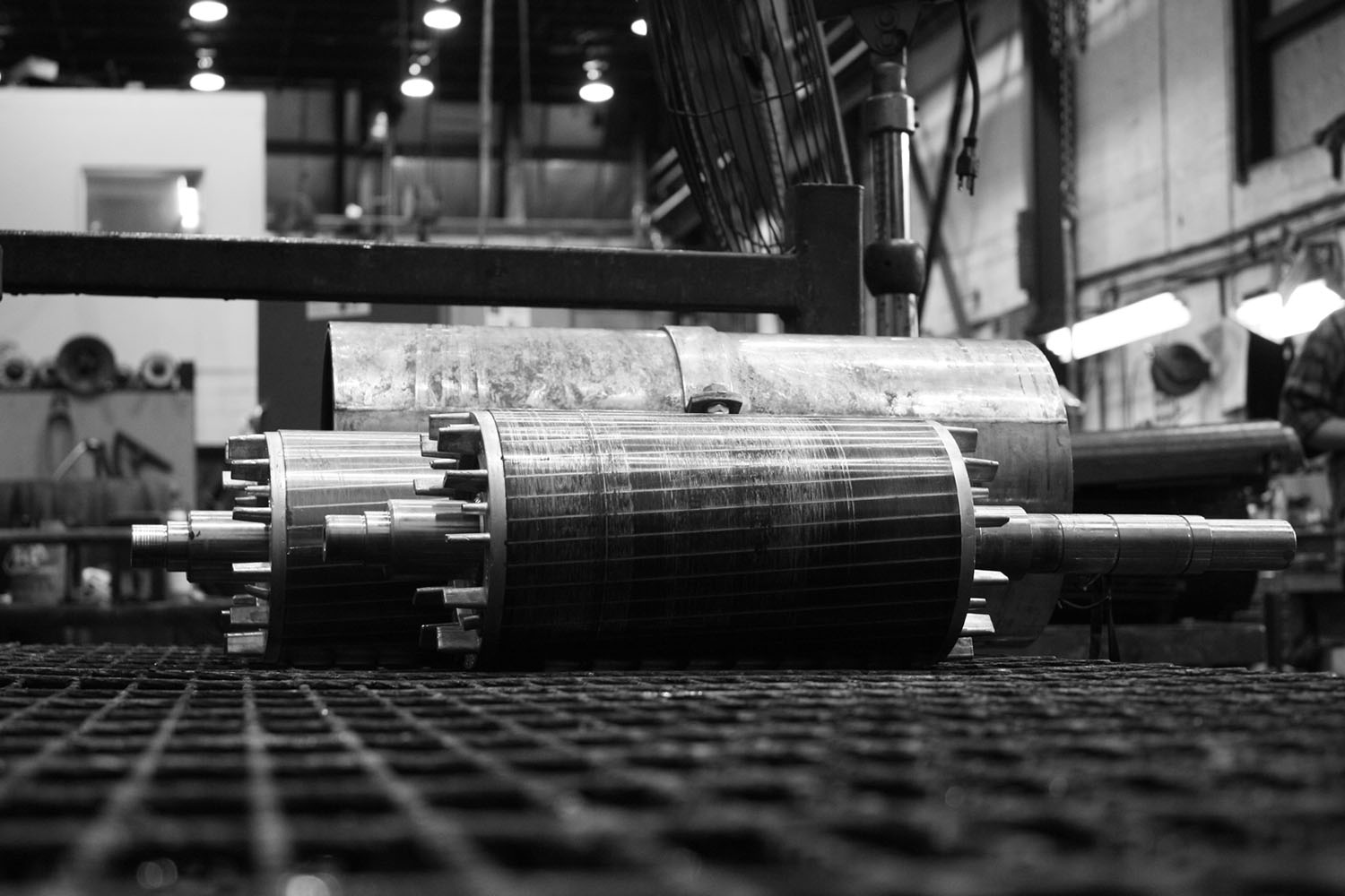
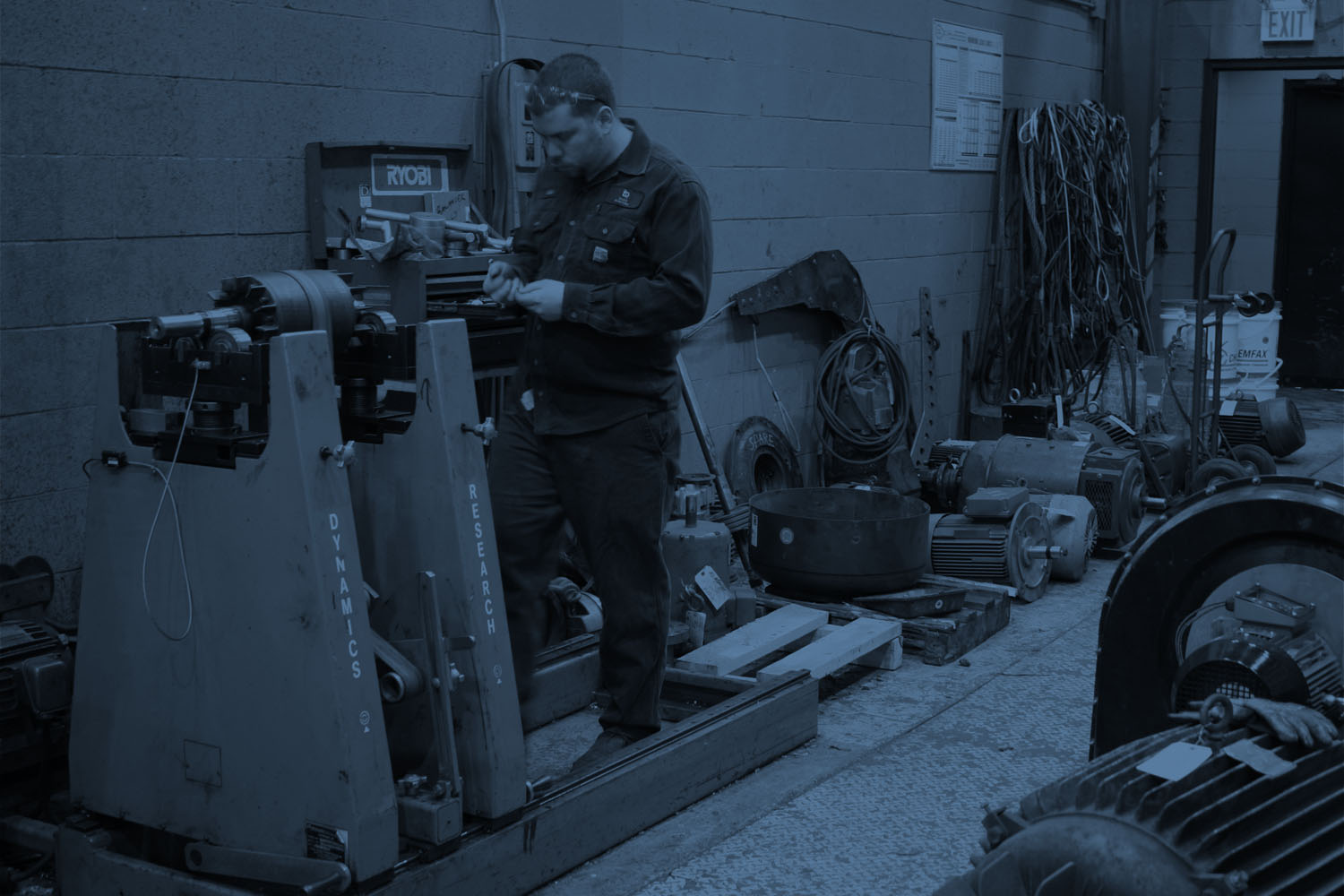
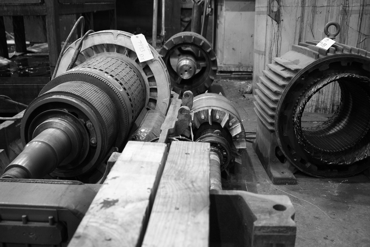
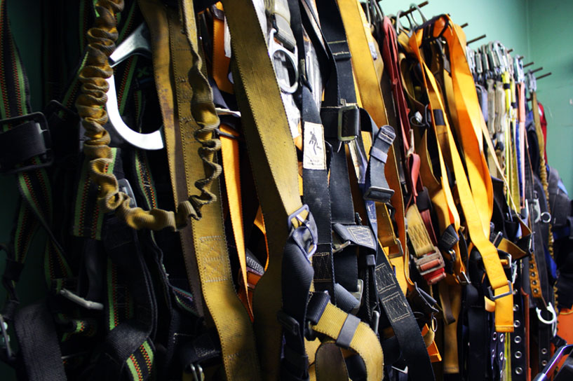
The Duke site is a real working 'shop' which holds thousands of electro-mechanical assets - from big iron to the smallest and most rare replacement parts. An on-site photography shoot allowed us to pull back the curtain and show the day-to-day running of this exciting and busy shop. Authentic imagery of the facilities, warehouse, product and employees was a powerful way to reinforce the personality of the brand and the real craftsmen that work there.
